Seaside Skin Care began as a small, local med-spa in San Clemente and grew into something more — a trusted space where confidence is cultivated, not constructed. Rooted in real relationships and expert care, Seaside has always put people before perfection. Today, its refreshed identity reflects that same belief: that feeling good should feel natural.
The Challenge: Seaside Skin Care wasn’t struggling, it was loved. But the brand hadn’t kept pace with what made it special. In a sea of sterile med spas and cookie-cutter aesthetics, Seaside’s warmth, trust, and real human connection were getting lost behind a dated visual identity and generic messaging.
SOLUTION
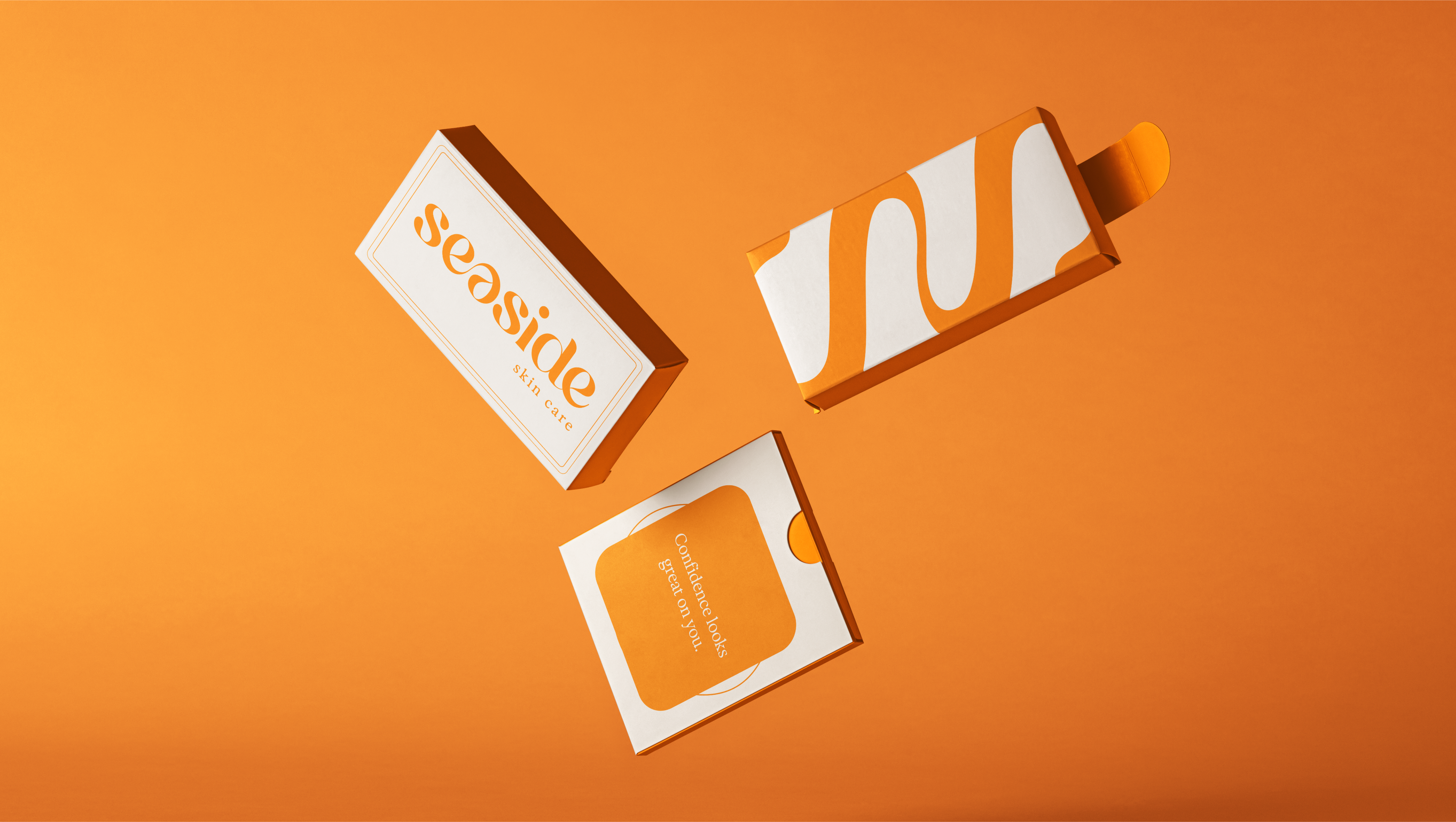
We stripped away the med-spa clichés and built a brand that actually feels like Seaside Skin Care. inviting, elevated, and unmistakably real.
From a bolder palette to a more grounded voice, everything was designed to reflect the people behind the place. No frozen faces. No fluffy jargon. Just real confidence, done beautifully.
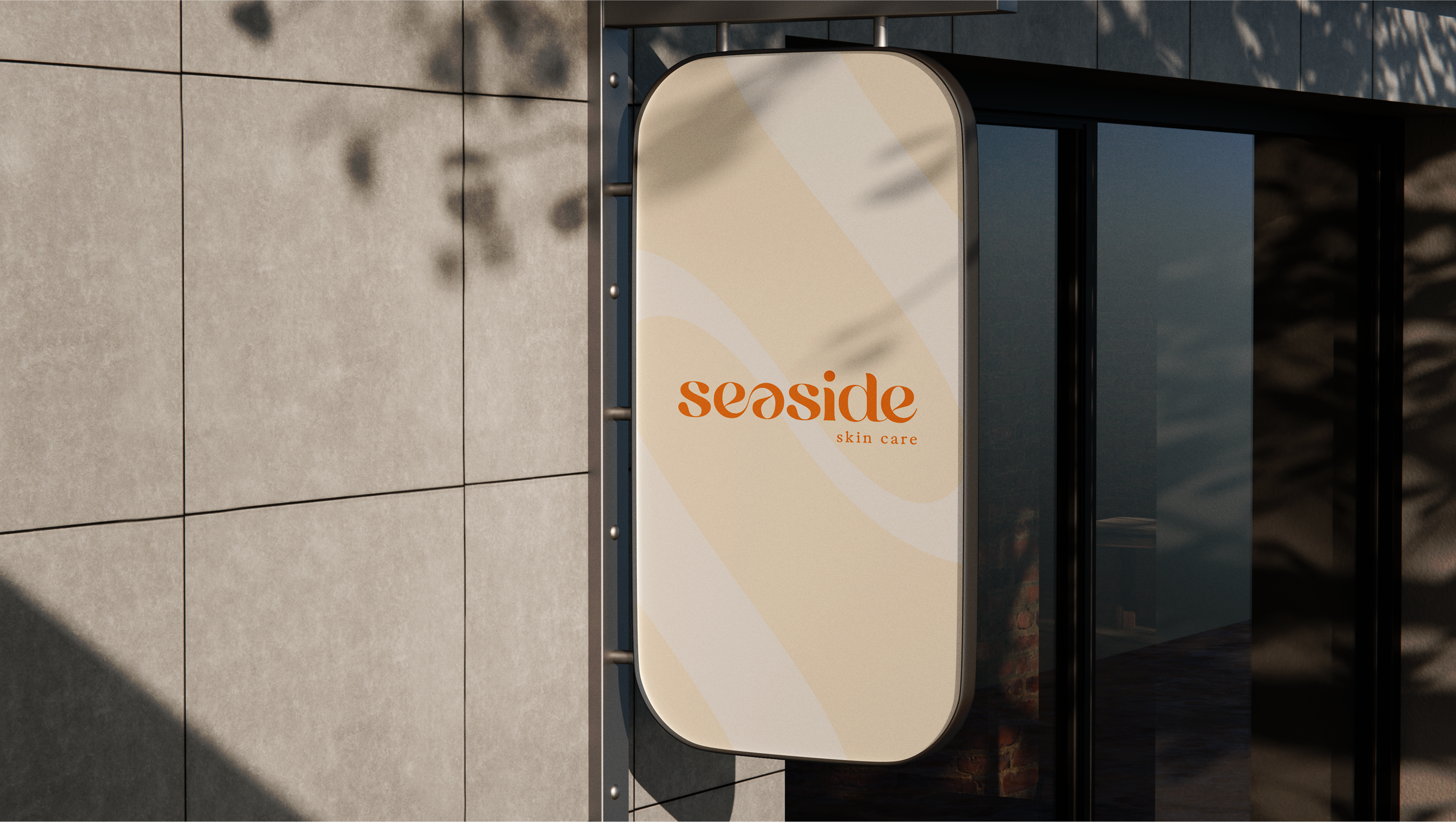
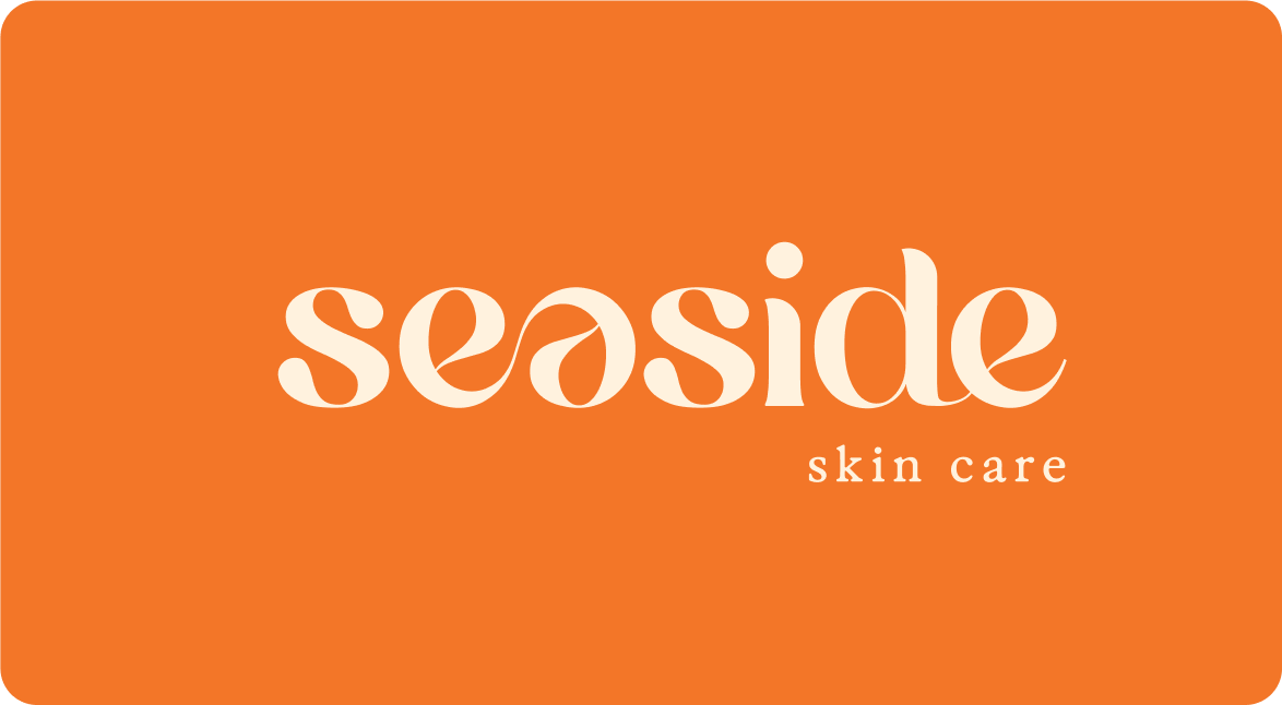
Our brand typeface, Exposure, reflects the heart of Seaside—modern, confident, and full of character. Its clean structure and subtle softness strike the right balance between clinical expertise and human warmth. With a range of thicknesses, Exposure brings versatility to the brand – allowing us to express both bold clarity and gentle nuance, depending on the moment. It’s elevated, approachable, and distinctly Seaside.