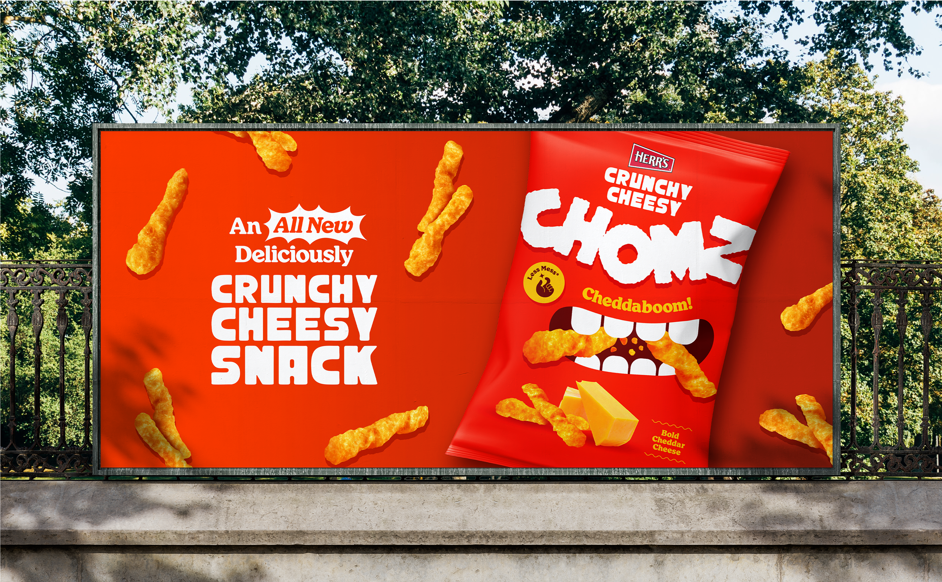
Say hello to Crunchy Cheesy Chomz — snacks that are so delicious that you can’t stop chomping. Embracing the fun, personality, and delicious taste in every bag. Get chomping.
Challenge:
How do we get consumers to reach for the Herr’s bag instead of our competitors? Most consumers don’t have a reason to switch from the snack they already know and love. Our challenge was to develop a distinctive visual identity that pops off the shelf, sparks intrigue, and an ‘I want to try that!’ response.
Taste and flavor is what sets this product apart, and we needed to communicate that to the world in a confident, bold and blatant way.
Solution:
We tested the boundaries of our creativity with our naming and visual identity to really grab attention and create a brand that is fresh, fun, different, and bold. We aimed to differentiate ourselves from the market leaders by creating a completely new and imaginative way of expressing our delicious taste and the unique flavor profiles that Herr’s are known for.
This brand is a love letter to the sound, texture and pure joy of snacking. We’re inviting snack lovers everywhere to ‘chom chom chom’ with us, tasting our varieties of cheesiness and a crunchiness that’s loud enough to make ‘em smile (and reach for us on the shelf).
Naming
Nom(noun): “An informal term used to imitate the sound of eating, or to express enjoyment of food. Commonly associated with the phrase ‘nom nom nom’, which mimics the noise someone might make while happily munching on something tasty.”
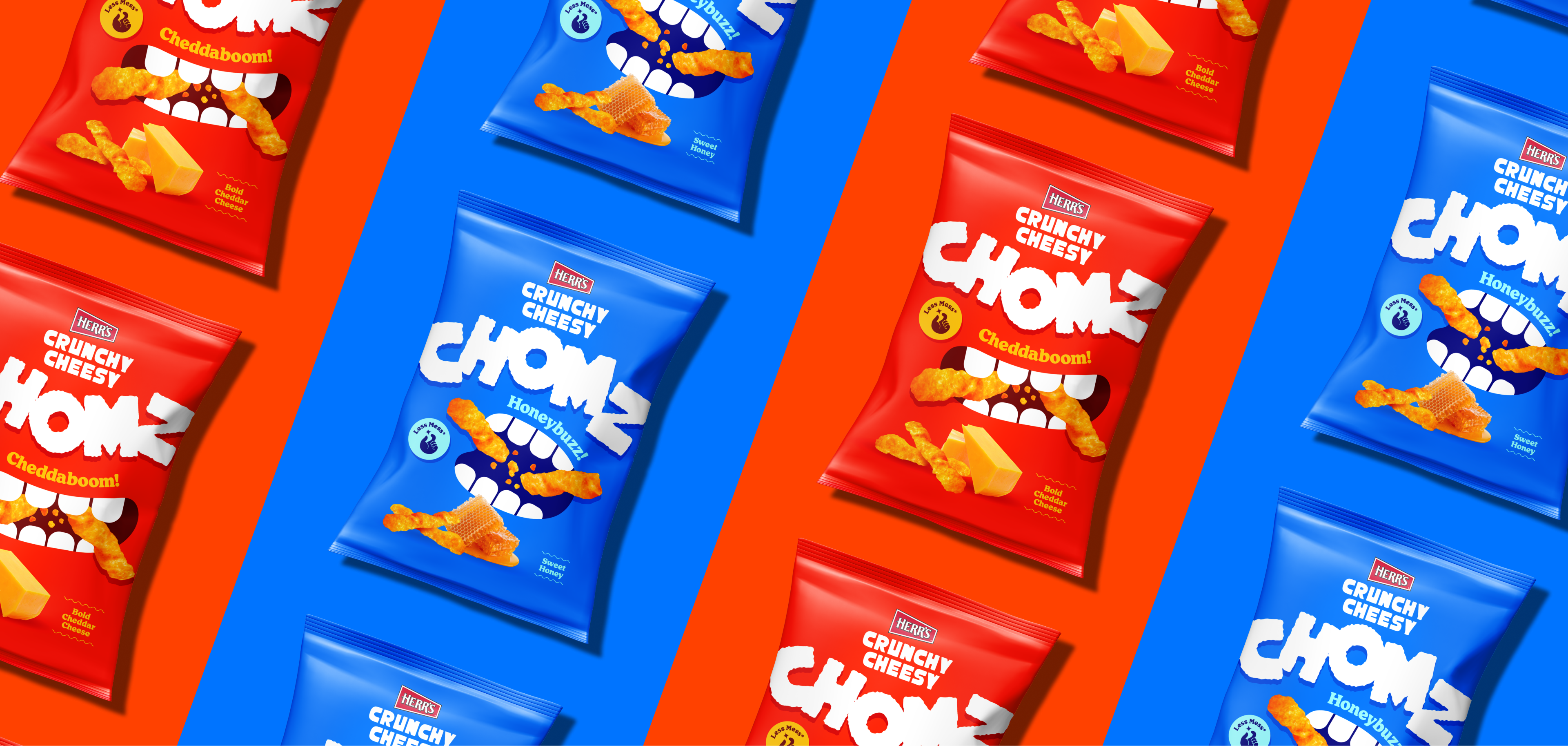
CHOMZ is a playful mashup of “crunchy,” “cheesy,” with the snacking sounds of “nom nom nom.” The name captures the fun, bold, and crave-able spirit of the snack; it’s simple, nostalgic, memorable, and evokes flavor and texture. A concept as bold as our bite.
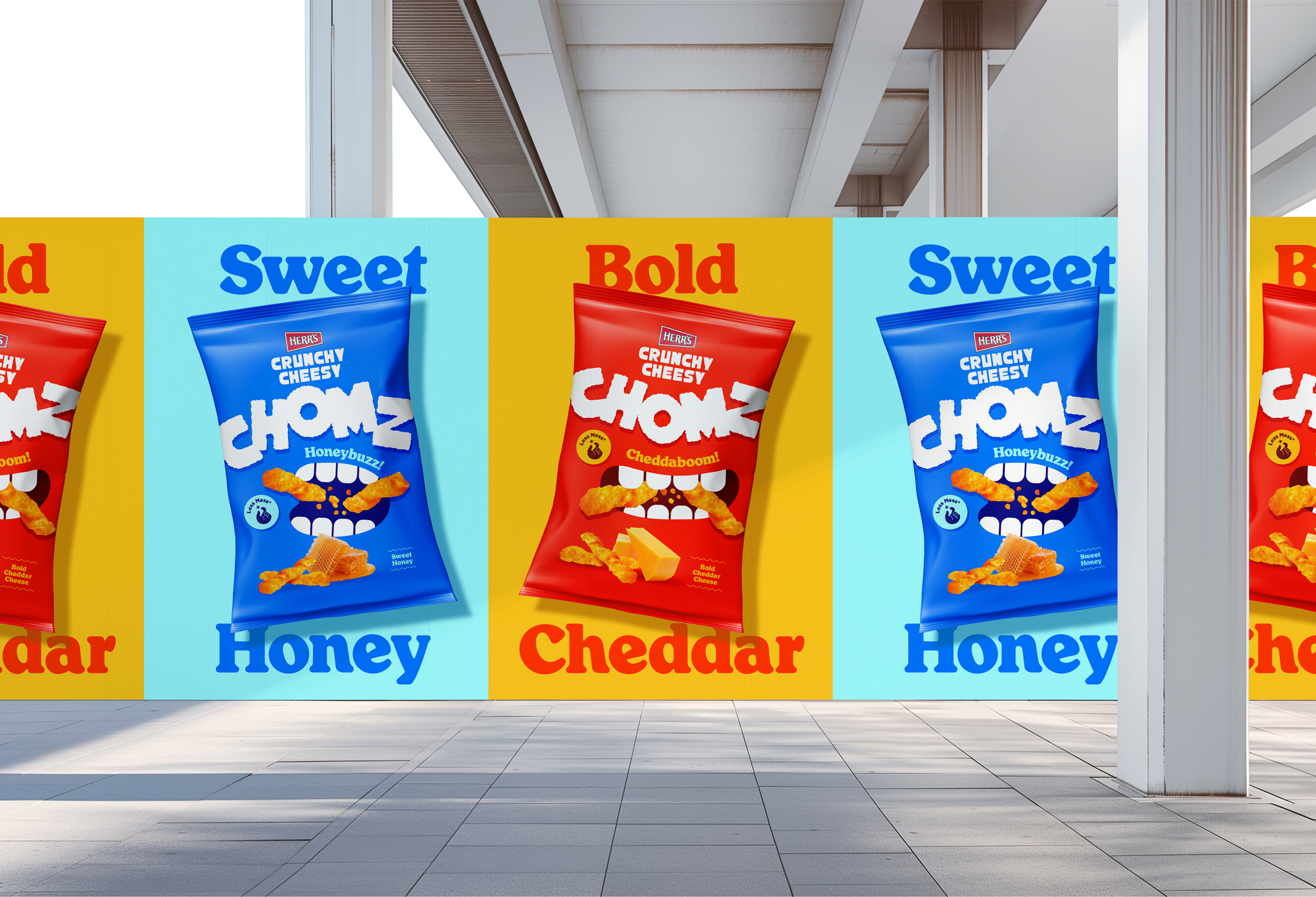
Inspired by the word ‘extraordinary’, our flavor names – Cheddaboom and Honeybuzz – are out of this world.
Visual Language
Each illustrated mouth is unique and shown at different moments of snacking, from wide open to mid-chomp. They serve as a central graphic element across packaging – maintaining a consistent illustrative style and bringing personality, energy, and flavor to life.
The Chomz logo and flavor name visually react to the shape of each bite motion on the packaging: the letters shift as if they are being knocked out of the way of the open mouths – reinforcing the energy, movement, and playfulness of the design.
Product Values
Feel Good Snacking
Family-owned since 1946
Better Taste
Proven to taste better than the others on the shelf.
A New Experience
New and exciting flavor varieties gives customers something different