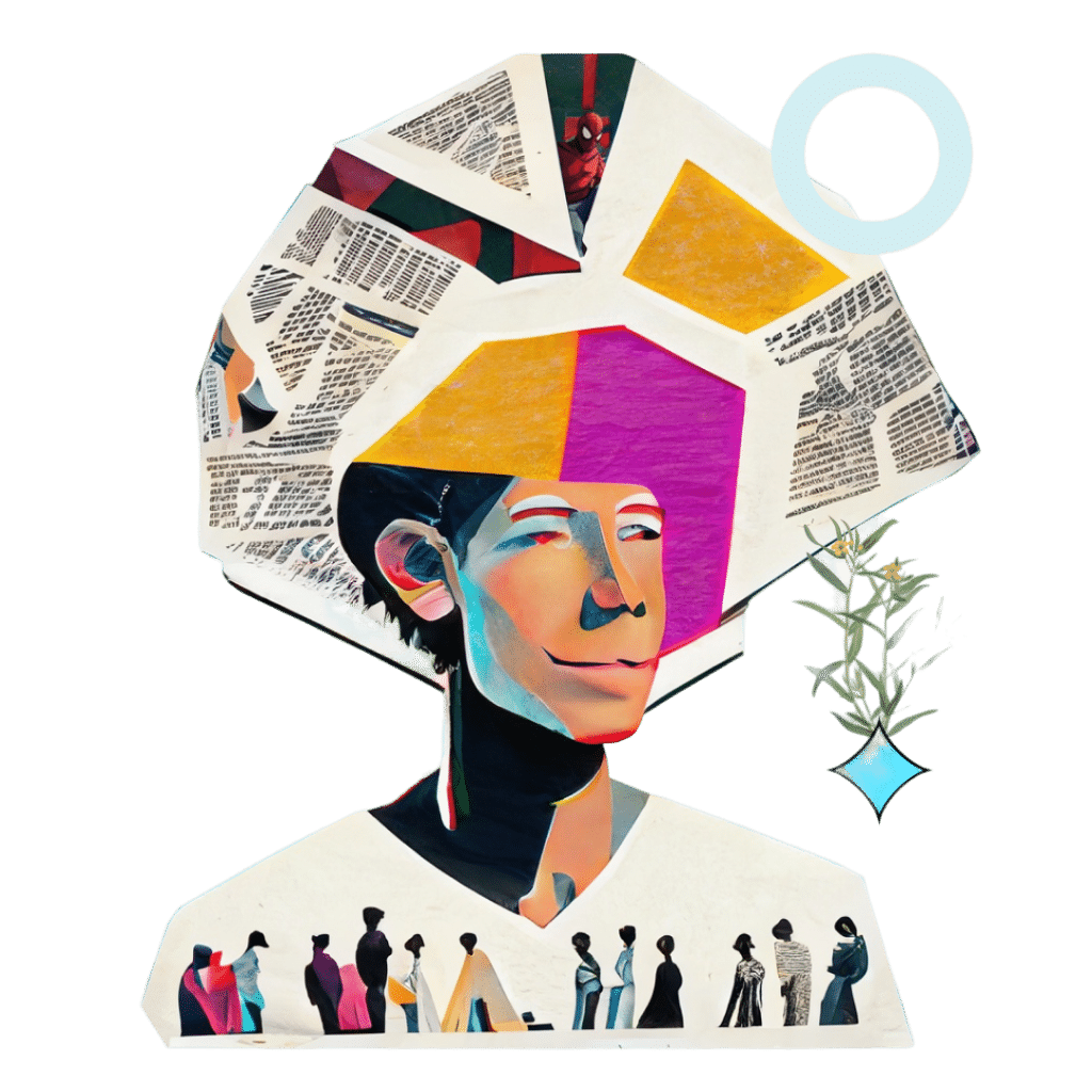
Every time I start a design project I always think and imagine what the color of the design is going to be. It helps me set the tone of the brand, and guides my mission and journey as a designer.
Color is one of the most powerful tools in the creative world. It brings depth and life into everything, evokes emotions, sets the tone, and makes a lasting impression. From the vibrant hues of pop art to the moody palettes of film noir, color has the ability to transport us to different worlds and connect us to the stories being told.
My favorite example is the iconic red and blue colors of Spider-Man’s suit, which not only represent his heroic identity but also embodies the spirit of his comic book origins. The impact and importance of color in pop culture cannot be overstated, as it shapes our perceptions and enriches our experiences in ways we may not even realize.
As a creative designer and artist, understanding how the use of color can create an emotion and influence perceptions is key. In the world of branding and graphic design, color plays a pivotal role in creating a lasting impression and establishing a company’s identity.
As the legendary Georgia O’Keeffe once said: “I found I could say things with colors and shapes that I couldn’t say any other way.”
One of my favorite design projects that I’ve ever worked on was the branding for a coworking space. This included not only the logo, color palette, and guidelines, but working with interior designers and architects to bring the branding element into the entire space.
The first thing we did was to find the tone and the essence of the brand and identify the purpose of the coworking space, which was to make people feel they’re in a comfortable place that makes them feel cozy, while also feeling like an elegant office environment. The goal was to attract an audience that appreciates a sophisticated, functional, and comfortable workplace culture. People using the space should feel that, through being provided with the necessary tools, they are in an environment that promotes the growth of their professional or personal intention. Knowing the tone of the brand, we knew that the colors needed to convey the same feeling.

Khaki green in combination with grays, contrasting with cream and light orange, was the perfect combination of a color palette that evokes a welcoming feeling while also showcasing elegance, timelessness, and a place where you could feel very comfortable and proud to work. After finding the tone, I realized that the logo needed to be something that could blend pretty easily into the environment while bringing something elegant and sophisticated.


Understanding the psychological associations of color is critical when it comes to branding and design. The right use of color can help create a strong emotional connection between a brand and its audience.
Colors evoke different emotions and carry various cultural and social connotations. For instance, in Western culture, blue is often associated with trust, stability, and reliability. On the other hand, in Eastern cultures, blue represents immortality and wisdom. Similarly, red is often associated with excitement, passion, and energy in Western culture, while in China, it’s a symbol of luck and prosperity. Understanding the cultural and social context of colors is crucial in creating a brand identity that resonates with the target audience.
The Role of Color in Branding
Color is not just a mere visual aspect, it is a powerful tool that can embody the essence of a brand. It can speak volumes about a brand’s values, personality, and mission. At Bald, we understand the impact of color on branding, and we live and breathe it in every project we undertake.
I recently had the experience of working with a global advisory services firm, and nailing the color palette was my top priority. We poured our hearts and souls into it because we knew that getting it right would be crucial in conveying their trustworthiness and dependability to their audience.
After careful consideration and strategic planning, we opted for a bold combination of blue and green hues. These colors exude a sense of reliability, dependence, and trust, which is precisely what our client wanted to convey. I wanted to differentiate them from their competitors who rely on cold and sterile technologically-driven colors. Our client wanted to stand out and make a lasting impression on their target market, and we are proud to say that we delivered.
The right color palette can make or break a brand, and we take this responsibility very seriously. It’s not just about aesthetics, it’s about creating an emotional connection with the audience and leaving a lasting impression that will resonate with them for years to come. At Bald, we believe that color is more than just a visual element; it’s an integral part of a brand’s identity, and we strive to help our clients achieve their goals through effective branding strategies.
The Role of Color in Graphic Design
The right use of color can help create a visually appealing design that captures the attention of the audience. Colors can be used to create contrast, balance, and hierarchy in a design, making it easier for the audience to understand the message.
The psychology of color is particularly important in web design, where colors can affect the user’s experience. For example, studies have shown that using warm colors such as red and orange can create a sense of urgency, making users more likely to take action. In contrast, cool colors such as blue and green can create a sense of calmness and relaxation.
Choosing the Right Color Palette
It is important to consider the target audience and the emotions that the brand or design wants to elicit. For example, a brand targeting children may want to use bright, bold colors that are fun and playful, while a brand targeting a more mature audience may want to use more subdued colors that convey sophistication and elegance.
It’s also important to consider color combinations. Some colors complement each other, others may not work well together. A good rule of thumb is to use contrasting colors to create visual interest while ensuring that the colors do not clash.
We can see the power of color in the branding of popular companies that have become household names. For instance, the red and white color scheme of Coca-Cola has been consistently used for over a century. The red color evokes excitement and energy, while the white conveys purity and cleanliness. It’s a perfect representation of the brand’s image.
Similarly, Starbucks uses a green color scheme that’s associated with growth, renewal, and freshness. The color aligns with the brand’s image as a purveyor of high-quality coffee and a commitment to sustainability.
Nike’s black-and-white color scheme is another example of effective branding. The black color conveys power and sophistication, while the white conveys purity and cleanliness. It perfectly aligns with the brand’s image as a provider of high-performance athletic gear.
The golden arches of McDonald’s are easily recognizable and have been consistently used for over a century. The golden color conveys happiness, warmth, and prosperity, perfectly aligning with the brand’s image as a provider of fast food that is both affordable and enjoyable. Their use of red is also added with purpose, as the color red in food makes humans salivate, which is a very interesting fact in the effect of color in psychology.
Color is obviously an incredibly powerful tool in branding and design, as it can create emotion, attract attention, and set a mood. By aligning color with the brand’s image, companies can create a strong and memorable brand identity that resonates with their target audience. And by understanding the psychology of color, designers can create a powerful relationship between the brand and its audience. To quote the famous graphic designer, Massimo Vignelli, “If you can design one thing, you can design everything.” So let’s use our design skills to create powerful, impactful brands, and let’s start colorful.


